Why I’m A Photographer Who Uses Less Color
Like most photographers, every time I pick up the camera, I hope to capture something interesting. Though the storytelling might be different for each photographer, there is usually a common goal, which is creating something pleasing for the eye. As we know, the human eye is a sophisticated device that could distinguish millions of colors. So one might ask, why not give it all the colors in the world?
How color works in visual arts
It turns out there’s a bit more than meets the eye. The word “color” is a general term to describe a visual sensation, which is actually a complex process for the eye and brain to work together and translate light. Luckily, In visual arts, there’s a neat three-dimensional system to define color: hue (the pure pigment or origin of color), saturation (the intensity), and value/lightness (the brightness). For example, the primary blue and yellow are different hues; a stronger red means it’s more saturated; a lighter green just means it’s brighter. With the help of these three metrics, it’s easier to understand color in visual arts, whether it’s painting or photography.

How color affects us visually and emotionally
Photography nowadays feels like a crowded place where each photo is a battleground for viewers’ attention. “Make the colors pop” is a common saying among photographers, especially when higher color saturation or brightness is used. This technique probably came from the popular salience hypothesis: a perception theory that we tend to focus on stimuli (people, objects, etc.) that stand out from the rest. Many photographers take this theory to heart and utilize the physical attributes (size, clarity, and intensity) to achieve visual saliency, which oftentimes leads to high color contrast or saturation.
However, other factors could eclipse the prominent physical attributes. Researchers at UC Davis found that in real-world scenes, meaning is actually the driving force to guide attention, instead of visual salience (Henderson & Hayes, 2017). For example, a cluttered kitchen table attracts more attention than a bright splash of sunlight on a wall. This is because the table objects have more real-world, contextual significance, whereas the splash of sunlight is purely a visual anomaly. This makes me rethink some of the visual language and the role of color in photography.
Color has a huge influence on our emotions as well. German researchers have found that our arousal increases with certain hues, such as from blue to red. Moreover, we have stronger emotional responses (skin conductance and heart rate) towards higher color saturation and brightness (Wilms & Oberfeld, 2018). This obviously explains the vibrant colors in TV commercials and food packaging. It’s the advertiser’s job to excite their audience and encourage them to take action. This philosophy has seeped into many other areas in our life, but I think it deserves more consideration, especially in non-commercial photography.

Photography by Sean Yang
What could go wrong in a world of color
Now with a little bit more understanding of color and its effects, it’s not hard to imagine color could work against one in photography when not used carefully. Here are a few examples:
Visual fatigue caused by overuse of color
When staring at bright and saturated colors, we put a lot of strain on the eye. And when the eye is tired, we are disengaged from the visual. Think about all the colorful images we see every day, and many of them are practically screaming colors at us to get our attention. Not only is this excessive use of color overstimulating, but it gets quickly drowned out in a pool of similar images. There have been many times I find myself scrolling through hundreds of images on Instagram with no lasting impression of them later.
Misuse of color theory or color psychology
Although it’s not rocket science, color harmony actually takes a lot of practice. For instance, when using colors that aren’t complementary (opposite on the color wheel) or analogous (adjacent on the color wheel), the final image could create some unease for the viewers. While this doesn’t make a bad picture by itself, it’s not ideal to use conflicting colors to create a peaceful environment. Another thing I’ve noticed is that people use templated color themes without consideration. For example, using a dark and saturated blue/green background in a photo, where a Mexican farmer is working hard in the field. Though it creates a mysterious atmosphere, it doesn’t really fit the scene.
Of course, this is only to say that color should be handled with care, not avoided at all costs. When color is used intelligently, amazing things can happen. Here are a few ways I use less color to improve an image:
How less color can make more impact
Use monochromatic or achromatic colors to achieve a minimalistic look.
When I want a clean visual, I pay attention to the framing and keep anything non-essential out of the frame. But colors can become a part of the visual clutter as well. The more colors one image has, the busier it feels. When there’s only one color or no color at all, an instant unification will take effect and a much cleaner visual will appear. A clean background can also help the viewers to focus on the subject in the foreground. Simple but effective. Of course, it is only a first step. Even in a black and white photo, there are still many intricacies involved in constructing a good final image.

Photography by Sean Yang
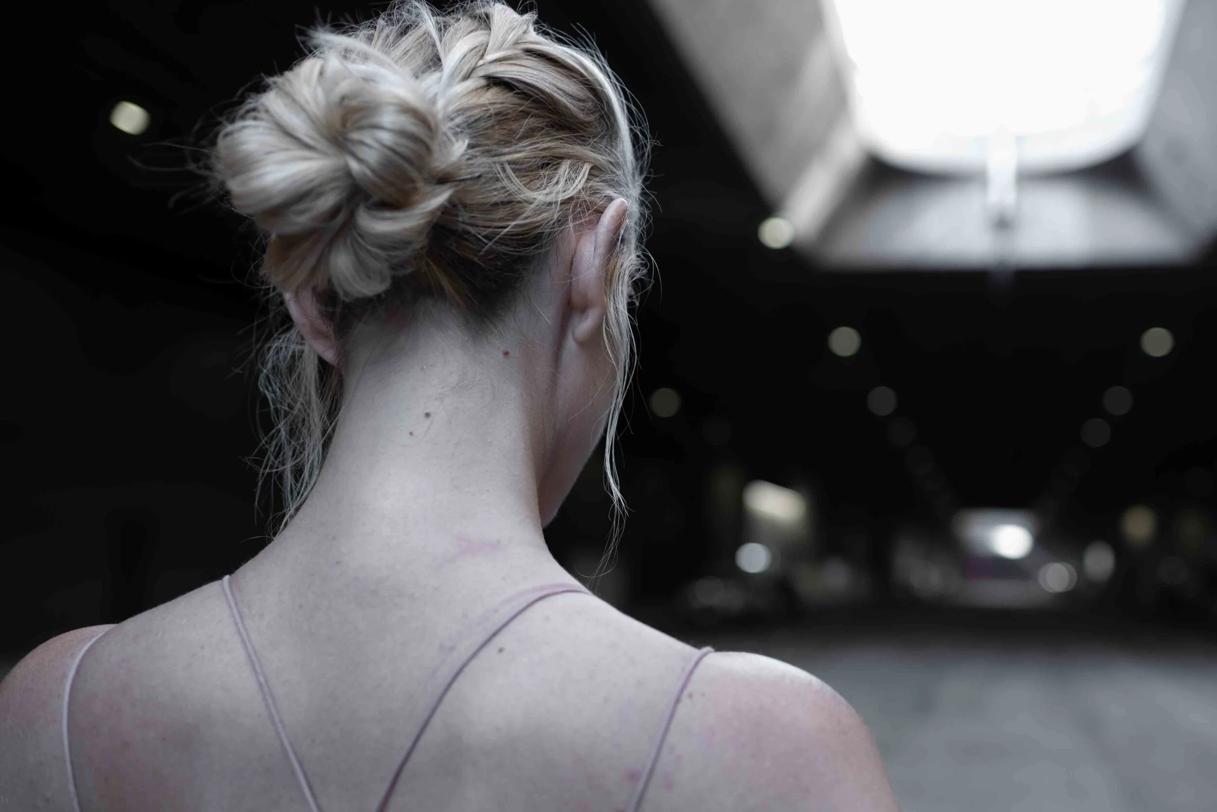
Use neutral colors for a calming and soothing effect
All neutral (black, white, grey, etc.) and near-neutral (ivory, beige, tan, etc.) colors are easy on the eye, so they’re often associated with relaxation and comfort, therefore widely used in interior design. When colors are muted or toned down, there will be less color contrast and smoother color transitions. This forms a continuity and leads to a softer overall image, which can be used to convey a sense of softness, lightness, or fragility. A neutral background can also help elevate dominant colors in the foreground.

Photography by Sean Yang
Use desaturated colors to craft specific scenes
Interestingly, desaturation reminds us of many things in life. For example, faded colors feel just like faded memories, which naturally creates nostalgia; washed-out colors render a scene unrealistically but can help create a dreamy or surreal look; stripping colors off a natural environment resembles the process of desertification, which can be used to depict a dystopian world. When it fits the theme, desaturation can add an extra layer of storytelling.
Photography by Sean Yang
Color is wonderful, but sometimes a little less color can work better to fulfill a photographer's vision: whether it's used for removing distractions, creating interesting moods, or simply providing a more pleasant visual experience. These decisions in photography not only reflect what the viewers see but what the visual means and how it makes people feel. Now when I pick up the camera or edit the photos again, I think about color and the final image with a little more intention.
References
Henderson, J. M., & Hayes, T. R. (2017). Meaning-based guidance of attention in scenes as revealed by meaning maps. Nature Human Behaviour, 1(10), 743–747. https://doi.org/10.1038/s41562-017-0208-0
Wilms, L., & Oberfeld, D. (2018). Color and emotion: effects of hue, saturation, and brightness. Psychological Research, 82(5), 896–914. https://doi.org/10.1007/s00426-017-0880-8